Harder than it looks
Who knew it would be so difficult to arrange strips of fabric in a seemingly random yet balanced manner? This is not the kind of skill I’ve had a chance to develop through knitting, although if I neglected my poor Gee’s Bend meets Mason Dixon blanket a little less, I might get more practice.
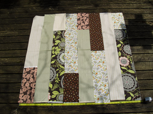
Exhibits 1 and 5 were the clear favorites, with 1 pulling ahead late in the race. (The social scientist in me wonders if this didn’t have something to do with them being the first and last options, and whether they would have gotten as much love if they’d been in the middle of the group.) Actually, they were my favorites, too. And you all made me think harder about what exactly appealed to me about each one.
Number 1:

This one has the most overt balance, I think: the diagonal parallel shift of the pink flowers and brown polka dot short strips; the strong Amy Butler browns spaced wide like columns; even distribution of lights and darks, with the lights forming a capital N if you squint at them. What bugged me: the Butlers being the same height, and the short strips along the top being equal in stubbiness.
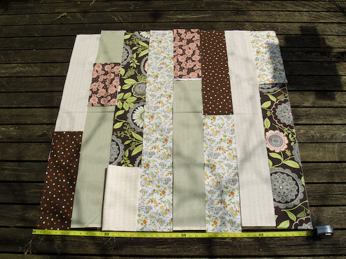
Number 5:

I liked the energy of this arrangement, the way my eye had to move over the composition. But ultimately it was, perhaps, a little too unsettling. Plus, using the squinting trick, there’s a vast past expanse at the lower center with no dark mass to counterbalance it. This is where I got to thinking that the lower edge might look funny with a dark binding.
I also realized I probably need a ninth strip for width if I want the thing to be square.
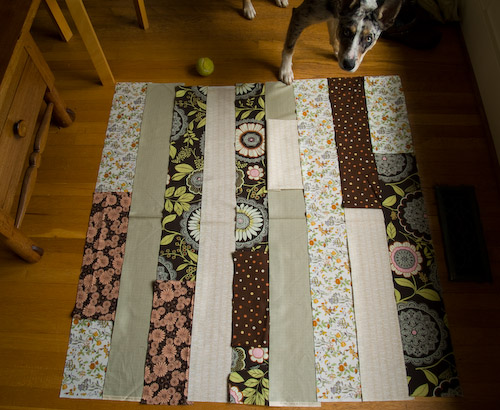
So I went back to the drawing board. I looked in Bend the Rules again and realized that Amy Karol’s version staggers the short strips in the middle of the long ones, as I did with the pink flowers in version 5. So I thought I might give that idea more thought. I also realized I’d forgotten what I was drawn to in Moonstitches’s pleasing sheets: the horizontal continuity she achieves by varying the width of the strips and keeping those with large patterns in the order they were cut from the cloth. That ability for the eye to slide sideways across the quilt gives it order, I think. Most of my fabrics don’t have a pattern that you’d notice repeating horizontally, but the Amy Butler does. I thought I’d try making use of it.

This time I’ve tried to reduce the chaos by reducing the number of darks on lights and vice versa. Seeing it on screen, I think I might make a further change: slide the brown polka dot interrupter up the Amy Butler background strip, and move the pale twiggy one down the green strip next to it. Swap them visually, so that the brown polka dots stay together and offset the pink florals diagonally, sort of as in version 1.
What do you think?
And yeah, I’m just gonna sew the dog hair right in.


Posted: April 29th, 2008 at 6:43 pm
Very pretty fabric selections. Quilting is something I haven’t tried my hand at, but this makes me want to!
Posted: April 30th, 2008 at 4:41 am
it looks like you’re learning a lot! i look forward to seeing it all put together.
Posted: April 30th, 2008 at 5:02 am
You’re not officially dressed unless you have cat/dog hair on. There is actually a group on Ravelry called “My Knitting has Cat Hair.” Love it!
Posted: April 30th, 2008 at 8:12 am
Looks great – I think you might nail it with the changes you’ve suggested.
I have a friend who is a prolific quilter; she says “auditioning” the fabrics is the most involved part of her art, so I’m not surprised to see you sorting it out so carefully.
Posted: April 30th, 2008 at 8:29 am
Pet hair makes everything better.
I like the pattern being carried across – it does draw the eye horizontally. However, for some reason (to me) the long, pale strips look a lot…stripy-er than in the previous squares. It’s more “dark/light” than random.
Posted: April 30th, 2008 at 8:45 am
I can see how that would be a difficult design task but I think the result is going to be beautiful.
Posted: April 30th, 2008 at 10:05 am
Very, very, very good work. I agree with the sliding ideas, too.
Posted: April 30th, 2008 at 12:05 pm
I think it’s going to look beautiful no matter what! I do agree that the latest incarnation feels more balanced.
Posted: April 30th, 2008 at 4:41 pm
Hi Sarah, your observations are very interesting. I think one can go crazy over really planning a quilt. I guess I do think a lot, too, but in general I love to leave a good deal of the designing work to “random”. With my leaves it was Just cutting the fabric, putting on piles and taking them randomly, without much thinking and sewing them together. I love unbalanced, mismatching, funny and odd combinations, little accidents like putting identical fabrics next to each other… all is adding to the charm of a piece, making it lovable because it’s not perfect.
I’d prefer version #5 and would do a dark binding at the lower part. And maybe two other shades for the rest of the quilt’s binding.
Love your fabric selection!
Posted: May 1st, 2008 at 12:28 am
First congrats on giving this go – its always nice to stretch one’s creative talents. It is looking great.
My favourite arrangement is the picture with the dog in it.
Good luck with the rest.
Posted: May 1st, 2008 at 7:43 am
It’s looking beautiful!!
Posted: May 1st, 2008 at 10:30 am
Still like number 1, but that’s me. Sew up what you like. A year from now you won’t remember the other arrangement and you will love it. Trust me on this!
Posted: May 1st, 2008 at 12:29 pm
I think that having the wide patterned strips arranged so that your eye sees the pattern makes the eye more willing to see the patterns in the other strips. It means that (at least for me) you can look at any one element and see the quilt as a cohesive unit. I like that.