At the drawing board
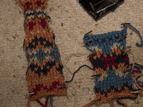
I promised you pictures of my ugly swatches, and I wouldn’t want to deny you all that kind of pleasure. Keep in mind that I snatched up some leftover scraps of Yorkshire Tweed 4-Ply to stand in–with only moderate accuracy–for colors I was imagining. You’ll have to a) overlook the lack of decent illumination when I took the pictures at midnight; b) imagine the blackish-blue is a nice dark indigo; c)pretend the off-white is a sort of apricot buff. On the other hand, it would have been ugly anyway, so you might as well save yourself the effort. Enough stalling already, Madam Garter:

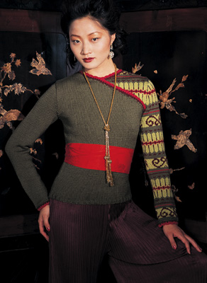
I had to give up this color scheme entirely, although I love the indigo, the orange and the red separately. (The good news is that I love knitting with this yarn. It’s buttery soft 100% merino Kona from Henry’s Attic.) So on Sunday I went to class without a plan. Browsing the store quickly for inspiration, I spied a copy of the new Holiday Vogue. Inside was this:

Hubba hubba! I don’t know how practical I’d find this sweater for everyday wear, but I sure do love the colors. (And how badly do I want a pair of those silky aubergine pantaloons?) So this is what I set out to emulate in my dyeing. No pictures yet, as I left my skeins in the workshop to dry, but I got fairly close to that loden color by using osage orange and then indigo, and then overdyeing with a quick dip in a particularly orange madder bath. It’s not very even — more blue in some spots and yellower in others — but it’s hand-dipped in natural dyes, so I don’t mind if it looks less than commercial. I also got a wasabi color I’m happy with, although it’s a little softer and less yellow than in the Vogue sweater, and a nice red. My highly potent logwood purple vat went straight past aubergine to deepest pansy blue-violet; I’ll decide next week if I think it will work or if I’ll try to get a shade that’s more burgundy. I also made another attempt at orange with the madder, which resulted in a richer shade than last week’s ill-fated bisque. The Elizabeth Zimmermann Fair Isle Yoke sweater (the blue swatch above is part of that pattern) needs a fifth color, and I was trying to decide what might work with the greens and purple and red.
Oh, and the 40-foot sock yarn skein? I gave up pretty quickly on the idea of trying to dip it in indigo. It would have taken a team of helpers and it might still have been a disaster. So I thought I’d go for peachy-orange and burgundy. It’s 100% merino, just like the Kona, and yet the best I could get was orange and raspberry sherbet colors. Puke. It must not have taken the mordant properly. I’ll try to overdye the washed-out raspberry next week.


Posted: October 31st, 2006 at 5:04 am
lots of dyeing going on out there! i think that you chose great colors as inspiration from that sweater in VK. i saw that too and loved the colors but not really the design. it’s nice to find inspiration where you least expect it!
Posted: October 31st, 2006 at 5:58 am
Yeah, when I saw that sweater I thought it would be the perfect “My First Colorwork” for me. Because you get practice, but it’s only a sleeve. Of course I guess you could say that about a Fair Isle yoke sweater, right? Sounds like you were having fun dyeing!
Posted: October 31st, 2006 at 6:05 am
All that dyeing! Sounds like great fun. Can’t wait to see how everything turns out. I agree with you about your Fair Isle Swatches. Somehow the terra cotta and the blue don’t go together, do they? I’m sure you’ll find the perfect combo!
Posted: October 31st, 2006 at 1:51 pm
Well, much as I hate knitting them, I guess that’s what swatches are for, right? I have no doubt that you’ll wind up with the perfect combination of colors. Fun dyeing inspiration piece, BTW!
Posted: October 31st, 2006 at 2:28 pm
That IS a beautiful sweater. I thought that the sash around her waist was a knitte part of the sweater at first.
Posted: October 31st, 2006 at 5:01 pm
hey they’re not THAT bad… i mean there are GRADES of ugly, aren’t there? ^_^ well, at least its wonderful yarn that you can work with again…. enjoy your yarn dyeing!
Posted: November 1st, 2006 at 9:18 am
Ooh, I love the colors in that VK sweater too! Your choices sound lovely. And I love that Kona stuff too–it’s so super-soft! It makes buttery, very fast socks that are still thin enough to fit in your shoes. 🙂
Posted: November 2nd, 2006 at 6:19 am
such lovely swatches. not ugly at all!
i dig both the colors and the oddball construction of that sweater, i have to admit. but i owed sistine chapel bell bottoms in high school.
and your seven dwarves description below was adorable.
Posted: November 2nd, 2006 at 8:34 pm
Who doesn’t want aubergine pantaloons!! Not me!!! (Oops, too many negatives. I’m trying to say that I, too, would like some aubergine pantaloons.)