Color studies II
Here’s what I learned about colorwork last week:

Project: “Mist” by Kim Hargreaves, from Rowan’s A Yorkshire Fable
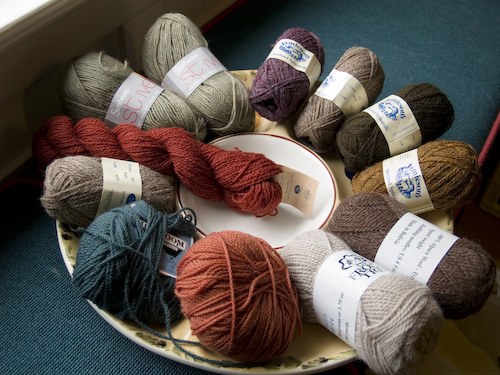
Yarn: Rowan Yorkshire Tweed 4-Ply, eight shades
Needles: US #2 and #3
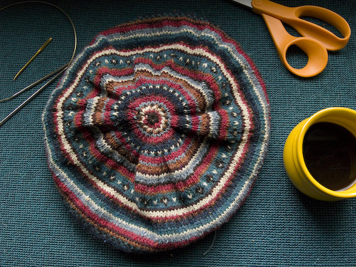
This beret is worked flat and then seamed up. This presents the special challenge of colorwork on purl rows. The center line of that teal band with brown and white crosses? Pure fiery hell, my friends. It’s the only line of the chart where Kim introduces a third color, and naturally it happened to fall on a WS row. I think the working of it may have taken me about half an hour. You bet your boots I realized this was going to be a problem from the outset, and if I could have thought of a way to knit this puppy in the round I would have. But alas, I possess neither 16″ circulars nor #3 double pointeds. And I confess I was concerned about the jogs looking messy anyway. So I worked it as given.
Overall, I’m pretty happy with the result. I scrapped the suggested pompon (yes, that’s the correct spelling – you can blame the French), because those are for the birds. I notice the folks who did the photo shoot for the book agree with me. I can just picture the Rowan fashion editor stalking the models with a pair of scissors – snip snip! – and little colored balls of fluff skittering away over the Yorkshire moors like so many grouse chicks. (Do they have grouse in Yorkshire?) Anyway, the hat looks rather ducky, although it needs to be blocked over a dinnerplate (thanks, EZ!) to achieve proper tam shape. Here’s what’s less ducky:

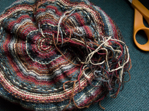
Ends, the curse of colorwork. Scores and scores of Medusa-like ends. Minus the ends, I love the purl side of fair isle, or anything stripey. I’ve long intended to knit a striped baby sweater intentionally wrong-side out.
So what did I learn about colorwork from this project, besides the devilish dexterity necessary to manipulate three working strands of yarn across a purl row? Don’t be afraid of bright and contrasting colors in fair isle. These are not the colors Kim H. dictated in the pattern. In my defense, Yorkshire Tweed 4-Ply is hard to find, having been discontinued, and for all my scrounging in yarn stores I never did come up with two of the shades she calls for. But I rejected the recommended lawn green and peacock blue as too garish for my taste, and that was probably a mistake. I chose eight colors I thought were harmonious, but I’ll bet it doesn’t look to you as if there are eight different colors in these pictures. The mulled wine, chocolate brown, and deep neptune blue are too close in value, and it’s hard to distinguish them unless you look very carefully. And the bone color looks very white in comparison to the darker shades. Lesson learned! I’ll go for more contrast when I start my mittens.


